Initial research on magazines: conventions, content type and audience of Dazed Magazine.
Conventions
Main image
- Takes up the whole cover
- The highlight of the issue
- A studio photographed close-up/mid-shot
Title (Masthead)
- A unique font
- 1-2 words
- Wide
- Sometimes the main image overlaps the title
Puff peice
- Promotions
- Giveaways
- competitions
Coverlines
- Atrract audiences attention
- Smaller to make title stand out
- positioned down the sides
- Usually the same font

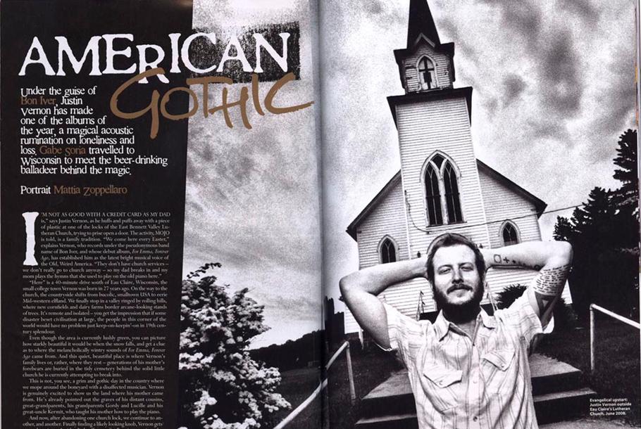
(Mojo magazines double page example)
(Dazed double page spread example)

(Dazed magazine double page spread example)

- The double page spread for both magazines are artsy and modern.
- The layout is not clustered and much like its cover adopts a minimalist approach. This makes readers more willing to read every article in the issue.
- Like the example from Mojo magazines images tend to run across both the pages.
- The bigger emphasis on visuals then writing may reflect its artistic influence.
- The composition of the images featured in the double page spread is a visual marvel and would grab the readers attention to read the article
Content
- Mix of genre
- Most artists on front cover are famous or have recent buzz
- Features ideas on fashion, photography, social life, film, music etc.
- 'Dazed' focuses more on the creator than the product
- They are less consumerist than other artistic magazines such as 'LOOK'
- Dazed chooses to focus on upcoming stars than established stars
Audience
- People who appreciate all forms of art
- Fashion, Literature, film and music lovers tend to read 'Dazed'
- This mostly consist of the younger generation who actively seek out diverse material
- Early 20s to 30s
- Those who have creative jobs as 'Dazed' doesn't focus on one area of art but a wide variety
Comments
Post a Comment